
Smartphone users in Grantham and Lincolnshire expect websites to feel just as smooth and accessible as those on any Desktop Monitor. Meeting these expectations means your site must adjust gracefully, using responsive web design to serve real customers on real devices. When you know how to analyse device needs and set strategic breakpoints, you create an online presence that attracts visitors and strengthens your business’s reputation across all screens.
Quick Summary
| Main Insight | Detailed Explanation |
|---|---|
| 1. Define strategic breakpoints | Identify three to four key screen widths for layout changes across devices to ensure a smooth user experience. |
| 2. Choose flexible layout methods | Opt for CSS Grid for complex designs and Flexbox for simpler structures, adapting to content needs effectively. |
| 3. Implement responsive images | Use HTML srcset and CSS media queries to ensure images scale appropriately, maintaining quality across device types. |
| 4. Design intuitive navigation | Prioritise mobile-friendly menus and consistent placement for ease of use and accessibility on all devices. |
| 5. Test across real devices | Conduct thorough performance testing on various physical devices to verify usability and design effectiveness in real-world scenarios. |
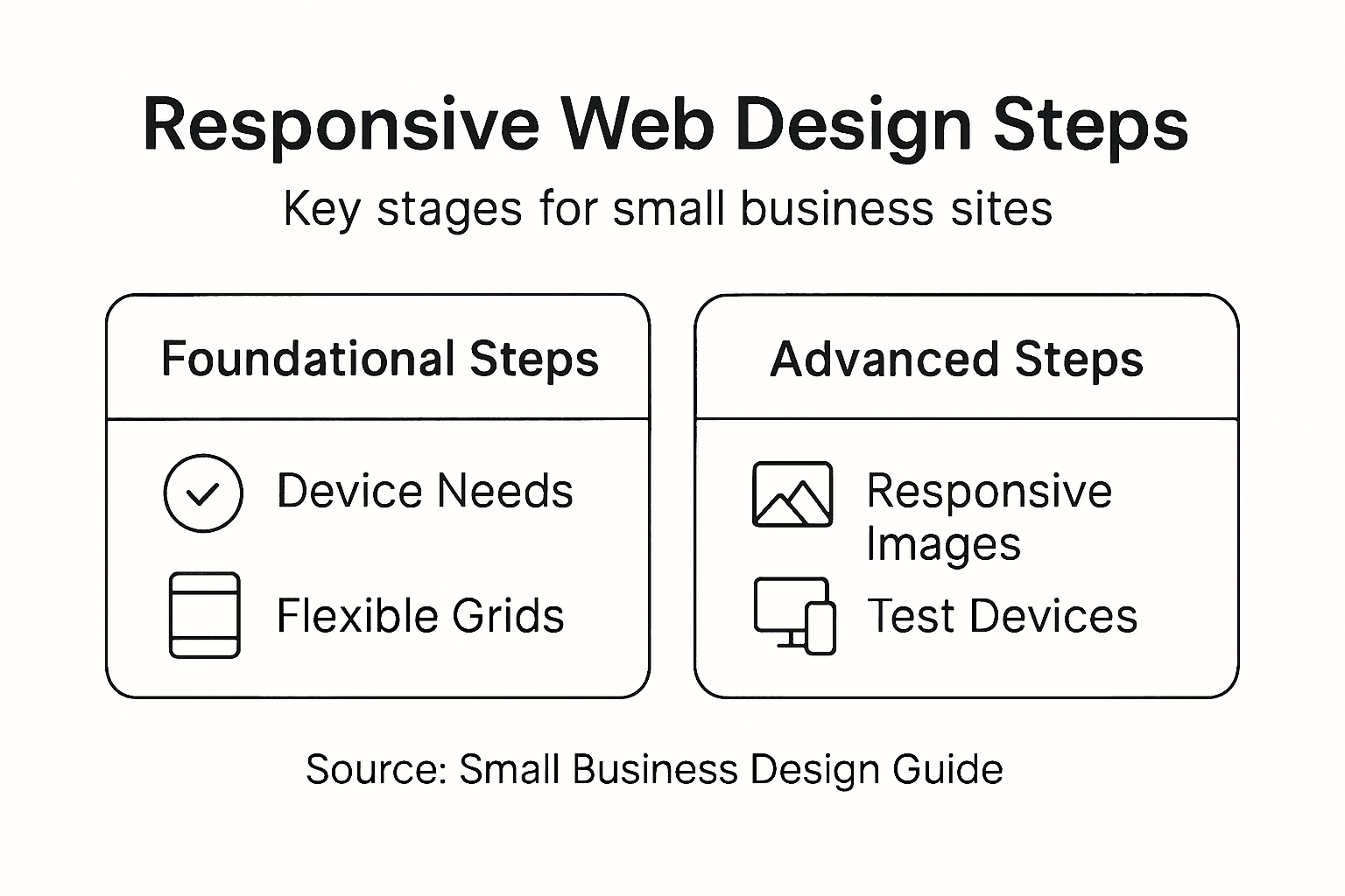
Step 1: Analyse device needs and set breakpoints
Creating a responsive website means understanding how your design will adapt across different devices and screen sizes. Responsive web design allows your site to look fantastic whether someone views it on a smartphone, tablet, or desktop computer.
To analyse device needs effectively, you’ll want to start by mapping out the most common screen sizes your target audience uses. This involves researching typical device resolutions and creating strategic breakpoints that determine how your layout will shift and adjust. Consider these key device categories:
- Smartphones (360-414px width)
- Tablets (768-1024px width)
- Desktop monitors (1024px and above)
When setting breakpoints, avoid creating too many - this can lead to complex, hard-to-maintain code. Instead, focus on three to four primary breakpoints that cover the majority of device types. CSS media queries will be your primary tool for implementing these layout changes.
Here’s a quick reference for common responsive breakpoints and their typical device types:
| Device Type | Typical Width Range | Example Usage |
|---|---|---|
| Smartphone | 360-414px | Mobile-first layouts |
| Tablet | 768-1024px | Split-column designs |
| Desktop Monitor | 1024px and above | Multi-column interfaces |
| Large Display | 1400px and above | Wide layouts, additional panels |
This table can help you tailor your design strategies for each device category based on their screen width.
Smart responsive design adapts seamlessly, not just by shrinking content, but by intelligently restructuring the layout.
Professional tip: Use browser developer tools to test your design at various screen sizes and simulate different devices. This allows you to see exactly how your breakpoints perform in real-world scenarios.
Pro tip: Always test your responsive design on actual devices, not just browser simulators, to catch nuanced rendering differences.
Step 2: Select scalable layouts and flexible grids
Designing a responsive website requires choosing layout technologies that adapt seamlessly across different devices. CSS Grid and Flexbox offer powerful tools for creating flexible, intelligent page designs that shift dynamically.
To create scalable layouts, you’ll want to understand the strengths of different grid systems. Your primary options include:
- CSS Grid: Perfect for complex two-dimensional layouts
- Flexbox: Ideal for one-dimensional content alignment
- Percentage-based sizing: Ensures proportional element scaling
Common grid layouts typically involve creating fluid columns that redistribute content intelligently. This means designing your layout to have strategic breakpoints where elements can reposition themselves smoothly.

The following table compares CSS Grid, Flexbox, and percentage-based sizing for responsive layouts:
| Layout Approach | Best For | Flexibility | Complexity |
|---|---|---|---|
| CSS Grid | Two-dimensional layouts | Highly adaptable | Moderate |
| Flexbox | One-dimensional alignment | Easy to use | Low |
| Percentage-based | Proportional resizing | Scalable | Very low |
This comparison helps in selecting the most suitable layout method for different design needs.
Responsive design isn’t about making things smaller - it’s about creating intelligent, adaptive interfaces.
Professional tip: Use browser developer tools to preview how your grid layout behaves across different screen sizes, allowing you to fine-tune your responsive design.
Pro tip: Always test your grid layouts on multiple real devices to ensure consistent performance across different screen resolutions.
Step 3: Implement responsive images and media
Making your website’s images and media look stunning across all devices requires strategic planning and clever technical implementation. Responsive image techniques enable you to deliver optimal visual experiences regardless of screen size or resolution.
To create truly adaptable media, you’ll want to focus on several key strategies:
- HTML srcset attributes: Provide multiple image sources
- Relative sizing: Use percentage-based widths
- CSS media queries: Dynamically adjust image display
- Compression techniques: Reduce file sizes without losing quality
Responsive image strategies involve using HTML and CSS to ensure your visual content scales intelligently. This means creating images that look crisp on both mobile phones and large desktop monitors, without compromising loading speed or visual clarity.
Smart responsive design transforms images from static elements into dynamic, adaptive content.
Professional tip: Utilise modern image formats like WebP that offer superior compression and quality compared to traditional JPG or PNG files.
Pro tip: Always preview your responsive images on multiple devices to ensure they display perfectly across different screen sizes and resolutions.
Step 4: Optimise navigation for all devices
Creating a seamless navigation experience across different devices requires thoughtful design and strategic implementation. Responsive navigation techniques ensure your website remains user-friendly whether accessed on a smartphone, tablet, or desktop computer.
To develop an effective responsive navigation strategy, consider these critical approaches:
- Mobile-first design: Prioritise touch-friendly navigation
- Flexible menu structures: Use collapsible or hamburger menus
- Consistent placement: Maintain predictable navigation locations
- Accessibility features: Support keyboard and screen reader interactions
Website navigation best practices emphasise creating intuitive menu systems that adapt smoothly across different screen sizes. This means designing navigation elements that are both visually appealing and functionally robust, allowing users to explore your site effortlessly.
Responsive navigation is about creating an intuitive journey, not just resizing buttons.
Professional tip: Implement CSS media queries to dynamically adjust navigation layout and interaction modes based on screen dimensions.
Pro tip: Test your navigation menu on multiple devices and screen sizes to ensure consistent usability and accessibility.
Step 5: Test responsiveness across real-world devices
Ensuring your website looks and functions perfectly across different devices requires comprehensive testing strategies. Responsive testing techniques help verify that your design adapts seamlessly to various screen sizes and device capabilities.
To thoroughly test your responsive design, implement these essential approaches:
- Browser developer tools: Simulate multiple device screens
- Physical device testing: Check performance on actual smartphones and tablets
- Cross-browser compatibility: Verify functionality across different web browsers
- Performance metrics: Assess loading times and user experience
Responsive design testing goes beyond simple visual checks. It involves understanding how your website performs under different network conditions, screen orientations, and user interaction modes.
Effective responsive testing reveals the true adaptability of your web design.
Professional tip: Use browser extensions and online tools that provide comprehensive device simulation and performance analysis.
Pro tip: Recruit friends or colleagues with diverse devices to perform real-world testing and provide honest feedback about your website’s usability.
Elevate Your Small Business Website with Expert Responsive Design
Building a responsive website that truly engages your audience can be challenging. This guide highlights key hurdles such as setting the right breakpoints, selecting scalable layouts, and optimising navigation for all devices. Small business owners often struggle with ensuring their site performs seamlessly on smartphones, tablets, and desktops while maintaining fast loading times and crisp visuals. At WebFuZsion, we understand these pain points and specialise in crafting custom websites that adapt intelligently to every screen size using the latest CSS Grid and Flexbox techniques.
Why settle for shrinking content when your website can be fully adaptive and user-friendly? Our professional team based in Grantham offers tailored web design and development services that not only solve responsiveness challenges but also boost your online presence with SEO enhancements. Ready to transform your site with dependable, scalable, and beautifully responsive layouts? Discover how WebFuZsion can help your small business shine on every device by visiting our landing page and learn more about our custom website builds. Take the first step toward a future-proof online presence and contact us at https://webfuzsion.co.uk today.
Recommended
- Master the Mobile Responsive Design Process for… | WebFuZsion Blog | WebFuZsion
- Responsive Web Design: Enhancing Sites for All… | WebFuZsion Blog | WebFuZsion
- Benefits of Website Redesign for Small Businesses | WebFuZsion Blog | WebFuZsion
- What Is Web Design and Why It Matters | WebFuZsion Blog | WebFuZsion
- blog | Penetas Partner in Ondernemen