
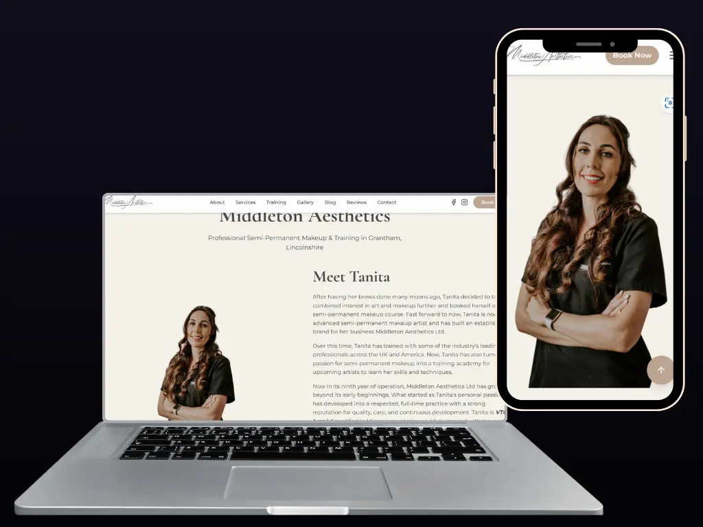
A website that looks fantastic on a desktop but falters on a mobile can lose your Grantham or Lincolnshire business valuable customers in seconds. With mobile devices increasingly varied in size and capability, responsive design is no longer a luxury but a necessity for reaching everyone effectively. This guide shows you how flexible, adaptable user interfaces create a smoother experience, improve accessibility, and make your business stand out to every visitor, whatever device they use.
Quick Summary
| Key Message | Explanation |
|---|---|
| 1. Assess device characteristics | Understand screen sizes, pixel densities, and input methods of target devices for effective design. |
| 2. Establish flexible layouts | Use fluid grids and modern CSS techniques to create adaptable and responsive website designs. |
| 3. Implement responsive media practices | Utilise adaptive images and CSS properties to maintain media quality across various devices. |
| 4. Test across devices | Conduct rigorous testing on actual devices to ensure optimal performance and user experience. |
| 5. Verify accessibility and user experience | Ensure your design is inclusive, catering to diverse user needs and interaction methods. |
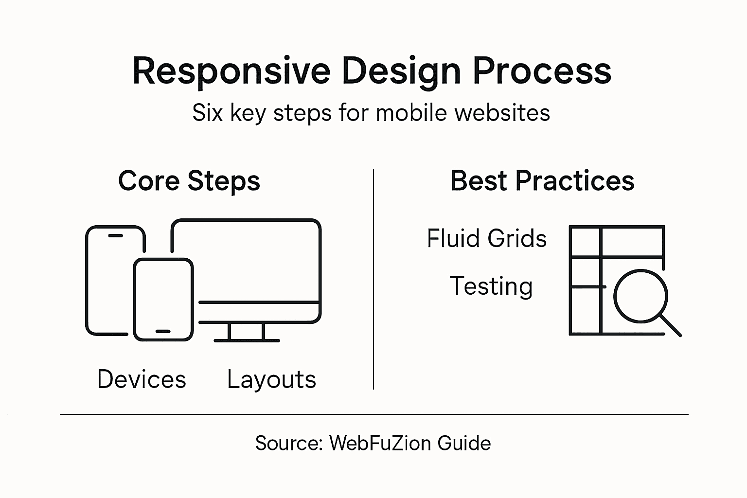
Step 1: Assess target devices and define requirements
Designing a mobile responsive website begins with understanding the diverse digital landscape where your site will live. Your goal is to create an adaptable interface that works seamlessly across smartphones, tablets, desktops, and everything in between.
Start by mapping out the primary device characteristics your target audience uses. This means investigating screen sizes, resolutions, input methods, and media capabilities. You’ll want to collect detailed data about:
- Smartphone screen sizes (from compact models to large-screen devices)
- Tablet dimensions and aspect ratios
- Desktop monitor resolutions
- Operating system distribution (iOS, Android, Windows)
- Average screen pixel densities
The key is creating a flexible design that automatically adjusts to different display environments. This approach, known as responsive web design, ensures your site remains functional and visually appealing across all devices.
Your website should be like water: fluid, adaptable, and capable of taking any shape required.
To define comprehensive requirements, consider usability models that highlight critical design parameters. These include effectiveness, efficiency, satisfaction, learnability, and cognitive load. Comprehensive testing across various devices will help you validate your design strategy and identify potential improvements.
Your research should also involve directly surveying your target users about their preferred devices and browsing habits. This granular understanding will inform design decisions that truly resonate with your audience.
Top tip: Create a comprehensive device matrix documenting screen sizes, pixel densities, and input capabilities before beginning your design process.
To clarify device requirements, here’s a quick device characteristic comparison:
| Device Type | Typical Screen Size | Common Input Method | Popular OS Examples |
|---|---|---|---|
| Smartphone | 4.7" to 6.7" diagonal | Touch, Voice | Android, iOS |
| Tablet | 7" to 12.9" diagonal | Touch, Stylus | iOS, Android |
| Desktop | 13" to 32"+ monitors | Mouse, Keyboard | Windows, macOS |
| Laptop | 11" to 17" screens | Trackpad, Keyboard | Windows, macOS |
| Large display | 33"+ screens, TVs | Remote, Touch, Mouse | Android TV, webOS |
Step 2: Establish flexible layout foundations
Now that you’ve mapped out your target devices, it’s time to create a responsive layout that adapts seamlessly across different screen sizes. The goal is to build a design foundation that’s as flexible as a gymnast - bending and stretching without breaking.
Responsive design requires fluid, adaptable frameworks that can dynamically reorganise content. This means moving beyond rigid, fixed-pixel layouts and embracing modern CSS techniques like Flexbox and CSS Grid.
Key principles for establishing flexible foundations include:
- Using relative units like percentages and viewport units
- Implementing scalable grid systems
- Designing with content fluidity as the primary focus
- Avoiding hard-coded pixel dimensions
- Prioritising dynamic content repositioning
A truly responsive layout should feel like water: formless, adaptable, filling whatever container it inhabits.
Modern design frameworks emphasise creating layouts that not only work today but remain future-proof. By establishing adaptive design principles, you ensure your website can handle emerging device types and screen configurations.
Consider using CSS units like:
- vw (viewport width)
- vh (viewport height)
- rem (root element size)
- % (percentage-based sizing)
These relative units allow your design to scale intelligently across different devices, providing a consistent user experience from tiny smartphone screens to massive desktop monitors.
The following table highlights how different CSS units support responsive layouts:
| CSS Unit | Scales With | Typical Use |
|---|---|---|
| % | Parent container | Fluid width grids |
| vw / vh | Viewport | Responsive font/image sizing |
| rem | Root font size | Consistent spacing |
| em | Current element | Scalable typography |
| px | Fixed pixels | Precise, non-scaling items |
Pro tip: Always test your responsive layouts on multiple devices and use browser developer tools to simulate different screen sizes during development.
Step 3: Implement fluid grids and scalable media
With your responsive design foundations laid, it’s time to dive into creating layouts that breathe and adapt like living organisms. Fluid grids are the skeleton of a truly responsive website, transforming rigid structures into flexible, intelligent frameworks.
Fluid grid systems replace fixed-width layouts with percentage-based columns that dynamically scale across different devices. This means your website’s layout will gracefully adjust whether someone views it on a smartphone, tablet, or desktop monitor.
Key strategies for implementing fluid grids include:
- Converting fixed pixel widths to percentage-based measurements
- Using CSS Grid and Flexbox for dynamic content positioning
- Defining maximum and minimum width constraints
- Ensuring consistent spacing and alignment
- Prioritising content hierarchy across different screen sizes
A responsive design should flow like water, filling its container without losing its essential character.
Responsive media techniques are crucial for maintaining visual quality. Consider implementing:
- HTML picture elements for adaptive images
- Srcset attributes for resolution switching
- Max-width and max-height CSS properties
- Vector graphics like SVG for scalable icons
These approaches ensure your images and media look crisp and professional across all device types, preventing pixelation or awkward cropping.
Remember that fluid grids are about intelligent design - not just stretching content, but thoughtfully reorganising it to maintain usability and aesthetic appeal.
Pro tip: Always use browser developer tools to test your responsive designs at multiple breakpoints, simulating various device sizes and orientations.
Step 4: Apply responsive frameworks and breakpoints
With your fluid grid foundations established, it’s time to leverage powerful responsive frameworks that transform your design from good to exceptional. Responsive frameworks provide the scaffolding that makes complex layouts look effortless across different devices.
Responsive frameworks offer predefined grid systems that dramatically simplify the development process. These tools come packed with utility classes and breakpoint definitions that allow you to create adaptive layouts with minimal custom coding.
Key considerations when applying responsive frameworks include:
- Selecting a framework compatible with your project requirements
- Understanding default grid configurations
- Customising utility classes
- Managing performance trade-offs
- Maintaining design consistency
A well-chosen framework is like a Swiss Army knife: versatile, reliable, and ready for any design challenge.
Media queries enable precise layout control by defining specific breakpoints where your design transforms. These breakpoints typically align with common device categories:
- Mobile (up to 576px)
- Tablet (577px - 992px)
- Desktop (993px and above)
- Large desktop (1200px and beyond)
Each breakpoint represents an opportunity to reimagine your layout, ensuring optimal user experience across different screen sizes. The key is creating smooth, intelligent transitions that feel natural and intuitive.
Pro tip: Always test your responsive design across multiple real devices, not just browser simulation tools, to ensure genuine cross-device compatibility.
Step 5: Test performance across device variations
With your responsive design framework implemented, it’s crucial to rigorously test performance across an array of devices and network conditions. Performance testing transforms theoretical design into a real-world, user-friendly experience.

Performance metrics guide critical optimisation strategies that ensure smooth user interactions regardless of device capabilities. This means diving deep into load times, rendering speeds, and responsiveness across diverse technological landscapes.
Key performance testing approaches include:
- Measuring page load speeds
- Evaluating rendering performance
- Testing interactivity across devices
- Assessing network condition responsiveness
- Checking visual stability on different screens
Performance is not a feature; it’s a fundamental requirement of modern web design.
Comprehensive testing involves multiple evaluation methods that go beyond simple automated checks:
- Expert technical inspections
- Automated performance testing tools
- Real-world user experience testing
- Cross-platform device evaluations
- Network condition simulations
Prioritise testing on devices representing your target audience, considering factors like screen size, operating system, and typical network speeds. The goal is creating a universally smooth experience that feels native on every device.
Pro tip: Use professional performance testing tools that simulate real-world conditions, including slower mobile networks and budget smartphone specifications.
Step 6: Verify accessibility and user experience
With your responsive design taking shape, it’s time to ensure your website is genuinely usable for everyone, regardless of their device or abilities. Accessibility testing transforms your design from merely functional to truly inclusive.
Responsive design improves user accessibility by adapting content presentation to meet diverse user needs. This means creating an experience that works seamlessly for people with different abilities, devices, and interaction preferences.
Key accessibility verification steps include:
- Checking colour contrast ratios
- Ensuring keyboard navigation functionality
- Verifying screen reader compatibility
- Testing touch target sizes
- Confirming content readability across devices
Accessibility is not a feature; it’s a fundamental human right in the digital world.
Responsive design supports diverse interaction modes by addressing several critical user experience parameters:
- Content reflowing without horizontal scrolling
- Adaptable touch targets
- Consistent navigation across devices
- Readable text without manual zooming
- Support for multitasking behaviours
Remember that true accessibility goes beyond technical compliance. It’s about creating an intuitive, welcoming digital environment that empowers all users, regardless of their technological capabilities.
Pro tip: Utilise automated accessibility testing tools alongside manual user testing to capture both technical compliance and genuine user experience nuances.
Elevate Your Website with Expert Mobile Responsive Design
Mastering the mobile responsive design process requires addressing the challenges of diverse devices, fluid grids and perfect performance across all screen sizes. If you find yourself struggling to create a website that adapts seamlessly from smartphones to desktops while maintaining usability and visual appeal, you are not alone. The goals of flexibility, accessibility and optimised user experience highlighted in this article are exactly where many businesses see opportunities for growth.
At WebFuZsion, we specialise in building fully responsive websites tailored to your unique needs. Our comprehensive service includes custom website creation, redesigns and ongoing maintenance to ensure your site performs flawlessly on any device. By applying proven strategies like flexible layout foundations, fluid grids and accessibility best practices, we deliver websites that engage your audience effectively. Discover how our expertise can transform your online presence by visiting our custom website design solutions. Ready to make your website water-like in adaptability and speed We invite you to take the next step and connect with our team for a personalised consultation tailored to your business today.
Recommended
- Responsive Web Design: Enhancing Sites for All… | WebFuZsion Blog | WebFuZsion
- 7 Types of Website Redesigns for Business Growth | WebFuZsion Blog | WebFuZsion
- What Is Web Design and Why It Matters | WebFuZsion Blog | WebFuZsion
- Benefits of Website Redesign for Small Businesses | WebFuZsion Blog | WebFuZsion
- Ricci Real Estate - Agifly