
A user visits your website on their mobile phone, but the text is too small and the images spill off the screen. This experience is all too common for businesses across Lincolnshire without a modern approach to web design. Responsive web design solves this problem by creating flexible layouts that adapt to every device, giving each visitor an easy, consistent experience. Explore how responsive web design principles can help your business thrive online with improved usability and search rankings.
Key Takeaways
| Point | Details |
|---|---|
| Responsive Design Principles | Employ fluid grids, flexible images, and media queries to adapt web pages for various devices and screen sizes. |
| User Experience Focus | Ensure consistent accessibility, seamless navigation, and fast load times to enhance user engagement across all platforms. |
| SEO Benefits | Mobile-friendly designs improve search engine rankings, offering greater visibility and potentially driving more organic traffic. |
| Common Pitfalls | Avoid fixed-width layouts and desktop-centric designs to ensure optimal performance and usability on mobile devices. |
Responsive web design: definition and key principles
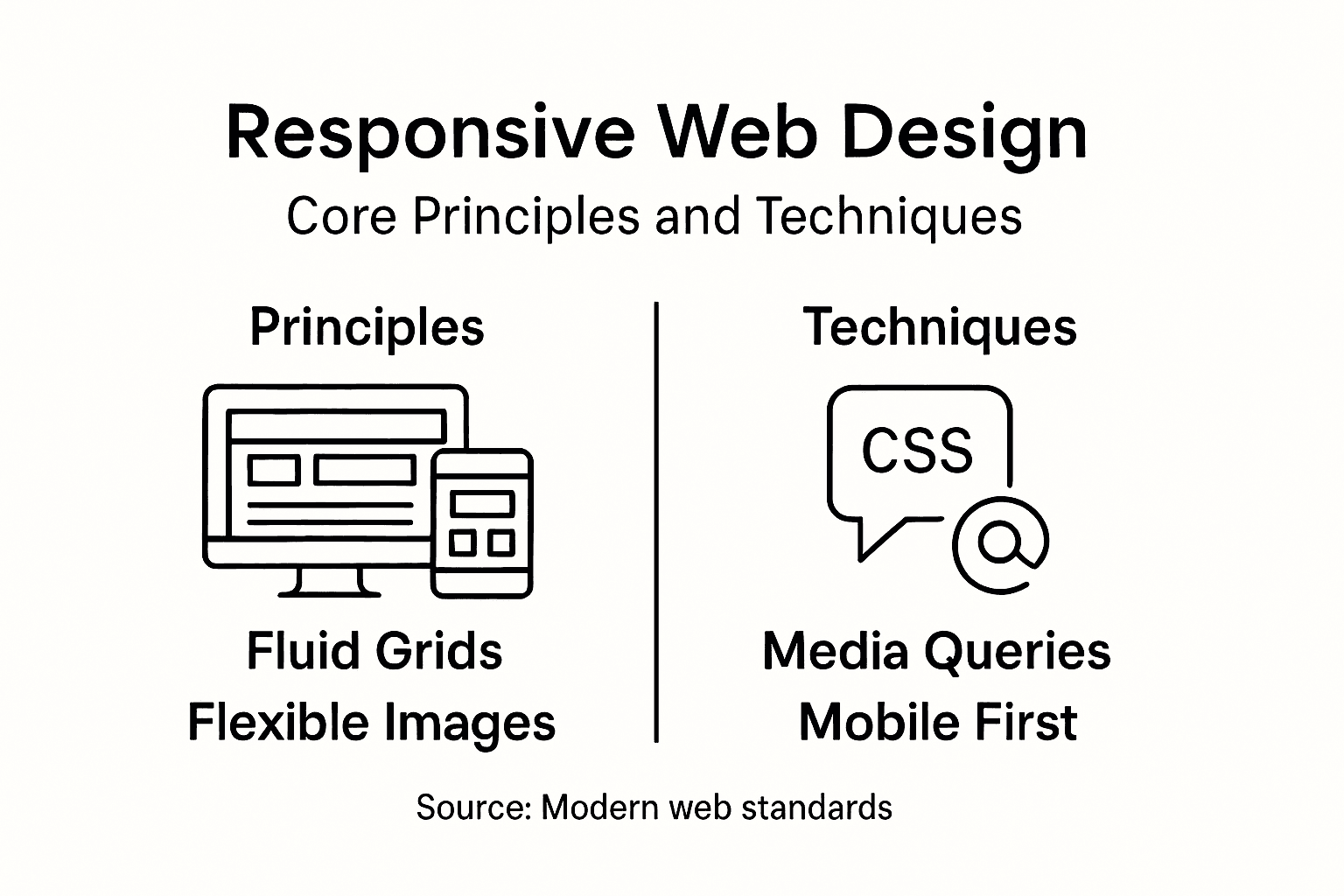
Responsive web design represents a fundamental approach to creating websites that provide an optimal viewing experience across various devices and screen sizes. At its core, responsive web design adapts web page layouts dynamically to ensure readability, usability, and visual appeal regardless of whether a user accesses the site from a smartphone, tablet, laptop, or desktop computer.
The key principles of responsive web design centre around three primary technical strategies:
- Fluid Grids: Layout structures that use relative sizing instead of fixed pixel measurements
- Flexible Images: Media elements that scale proportionally within their containing elements
- Media Queries: CSS techniques that apply different styling rules based on device characteristics
Historically, web design followed a rigid approach where websites were created with fixed-width layouts optimised for desktop screens. However, with the proliferation of mobile devices, designers recognised the need for more adaptable solutions. Ethan Marcotte’s pioneering work transformed the industry by introducing a holistic approach that treats web design as a fluid, responsive ecosystem.
Here is a summary contrasting traditional fixed-width web design with modern responsive design principles:
| Characteristic | Fixed-Width Design | Responsive Design |
|---|---|---|
| Layout Type | Static, non-adaptive | Fluid, adjusts to device |
| Device Compatibility | Desktop-focused | All screen sizes |
| Maintenance Effort | High, needs multiple versions | Lower, single codebase adapts |
| User Experience | Inconsistent across devices | Consistent and optimised |
| SEO Impact | Potentially negative | Favourable for ranking |
Media Queries serve as the cornerstone of responsive design, enabling developers to craft intricate rules that restructure page layouts based on specific device parameters. These queries can detect screen width, resolution, orientation, and other critical characteristics, allowing websites to deliver tailored experiences.
Pro tip: Always prioritise mobile-first design strategies, starting with the smallest screen size and progressively enhancing layouts for larger displays.
How responsive websites adapt to devices
Responsive websites leverage sophisticated techniques to dynamically adjust content across different devices, ensuring an optimal user experience. Responsive design strategies employ multiple technical approaches to create flexible, adaptable web interfaces that seamlessly transform between smartphones, tablets, and desktop screens.
The primary adaptation mechanisms include:
- Breakpoint Detection: Identifying specific screen width thresholds where layout modifications occur
- Fluid Grid Systems: Implementing proportional sizing rather than fixed pixel dimensions
- Flexible Media: Scaling images and content dynamically to fit different screen sizes
- Viewport Configuration: Adjusting display parameters to match device specifications
The technical foundation of device adaptation relies heavily on CSS Media Queries, which act as intelligent switches that trigger different styling rules based on device characteristics. Mobile-first design principles recommend starting with mobile layout configurations and progressively enhancing designs for larger screens, ensuring core content remains accessible across all platforms.

Understanding device adaptation requires recognising that responsive design is not just about resizing elements, but creating a holistic user experience that maintains functionality, readability, and aesthetic integrity across diverse screen sizes and resolutions.
Pro tip: Test your responsive design across multiple devices and screen sizes to ensure consistent performance and user experience.
Core benefits for user experience and SEO
Responsive web design strategies revolutionise digital experiences by simultaneously enhancing user interaction and search engine performance. This approach delivers a comprehensive solution that addresses both human and algorithmic expectations for website functionality across diverse digital platforms.
The core benefits for user experience encompass multiple critical dimensions:
- Consistent Accessibility: Ensuring content remains readable and navigable on any device
- Reduced Friction: Eliminating user frustration associated with poor mobile experiences
- Seamless Navigation: Maintaining intuitive interface design across screen sizes
- Faster Load Times: Optimising performance for mobile and desktop users
From an SEO perspective, responsive design offers substantial strategic advantages. Mobile-friendly websites receive preferential treatment from search engines, particularly Google, which prioritises mobile-compatible sites in search rankings. This technical approach directly influences visibility, potentially improving search positioning and driving increased organic traffic.
Moreover, responsive design supports broader accessibility goals, ensuring websites remain usable for individuals with diverse technological capabilities and device preferences. By creating a unified experience that adapts intelligently, businesses can effectively communicate their message while meeting contemporary digital standards.
Pro tip: Regularly test your responsive design across multiple devices and screen resolutions to maintain optimal user experience and search engine compatibility.
Essential tools and techniques used in practice
Responsive design techniques have evolved significantly, offering developers a robust toolkit for creating adaptable web experiences. Modern web design demands sophisticated approaches that seamlessly transform content across multiple device types and screen resolutions.
Key technical tools and methodologies include:
- CSS Flexbox: Enabling dynamic content alignment and distribution
- CSS Grid: Creating complex, responsive layout structures
- Media Queries: Implementing conditional styling based on device characteristics
- Viewport Meta Tag: Controlling initial page scaling and rendering
- Responsive Image Techniques: Ensuring media adapts to different screen sizes
Responsive web frameworks like Bootstrap and Tailwind provide pre-built components and grid systems that accelerate development. These frameworks offer standardised solutions for handling breakpoints, fluid layouts, and cross-device compatibility, reducing the complexity of manual responsive design implementation.
Beyond technical tools, successful responsive design requires a holistic approach that combines technical expertise with user-centric design principles. Developers must consider not just how elements resize, but how the entire user experience transforms across different devices and screen contexts.
Below is a reference table outlining essential responsive web design tools and their primary functions:
| Tool/Technique | Main Purpose | Common Usage |
|---|---|---|
| CSS Flexbox | Flexible element alignment | Dynamic navigation bars |
| CSS Grid | Complex layout structure | Multi-column content areas |
| Media Queries | Conditional styling | Different style rules per device |
| Viewport Meta Tag | Initial page scaling control | Mobile device optimisation |
| Responsive Images | Image adaption to device | Ensuring sharp visuals everywhere |
Pro tip: Leverage browser developer tools to simulate and test responsive designs across multiple device sizes and orientations.
Common mistakes and pitfalls to avoid
Responsive design mistakes can significantly undermine website performance and user experience. Understanding these common pitfalls is crucial for creating adaptable, user-friendly digital interfaces that function seamlessly across multiple devices.
Key mistakes to be aware of include:
- Fixed Width Layouts: Preventing natural content adaptation
- Neglecting Mobile-First Approach: Creating desktop-centric designs
- Performance Optimization Failures: Causing slow loading times
- Inconsistent Touch Target Sizing: Making navigation difficult on mobile devices
- Overcomplicated Design: Reducing usability across different screen sizes
Technical implementation challenges often stem from improper use of media queries and viewport configurations. Developers must carefully balance design complexity with functional simplicity, ensuring that responsive techniques enhance rather than complicate user interaction.
The most effective responsive designs prioritise content hierarchy and usability over pixel-perfect replication across all devices. This means accepting that a website might look slightly different on various screens while maintaining core functionality and readability.
Pro tip: Always conduct comprehensive cross-device testing using real devices and browser developer tools to identify and resolve responsive design issues.
Elevate Your Website with Expert Responsive Web Design
Understanding the challenges of creating a website that truly adapts to every device is essential in today’s digital world. Your visitors expect seamless navigation, fast load times and consistent readability whether they use a smartphone, tablet or desktop. At WebFuZsion, we specialise in custom responsive web design that solves these common pain points by implementing fluid grids, media queries and mobile-first strategies tailored specifically for your business needs.
Take advantage of our professional web design and development services to ensure your site performs excellently across all screen sizes. Explore our full range of solutions including bespoke website builds, redesigns and SEO enhancements on the WebFuZsion landing page. Ready to transform user experience and boost your search engine rankings with a responsive design that works perfectly for your audience? Contact us today at https://webfuzsion.co.uk and start your journey towards a powerful, adaptable online presence.
Recommended
Frequently Asked Questions
What is responsive web design?
Responsive web design is an approach to creating websites that provide optimal viewing experiences across various devices by dynamically adapting layouts to suit different screen sizes, ensuring usability and readability.